When we enter an online shop, our subconscious quickly determines whether and how long we want to stay there. In addition to the desire for an inviting start page, a tidy, meaningful navigation, a clear page and layout structure and a fast and uncomplicated performance, we humans are actually very simple: one of the most important points for arousing interest is emotion in the shortest possible way , namely through the appropriate imagery. Visual stimuli initially decide very quickly whether we feel comfortable and want to stay on a page.
It's not just about making each category an emotional explosion, but also about openness, meaningful attention to detail and authenticity. What tells us a story, what immerses us and is honest, creates a framework and lets us understand why we really need something. And of course it is always an individual story from product to product. Nevertheless, there are a few basics that we can use to make a difference, not only to interest customers, but also to rummage around and encourage them to make a potential purchase.
Pictures in the online shop: define a target effect
We roughly differentiate between two categories on an online presence with shop visuals: mood images such as category images, header images, visual storytelling, as well as content images and product images on the other hand. With both, the approach to recording and selection depends on the desired effect, which of course differs significantly.
Nevertheless, the questions we should ask ourselves before production and selection are very similar:
1. The image concept
We should be clear about which brand/product we want to create an image concept for and can use this to define a target group. This is of course an absolute basic and has hopefully already been defined in the design concept during the step "Create image concept", but it is nevertheless essential and therefore worth mentioning. For example, if we want to advertise sunglasses for a dashing mid-sixties, it makes less sense to illustrate a mid-twenties with a surfboard under her arm on a breakneck rocky surf coast with 20m high sea waves. This might work in certain circumstances when we're delivering a transfer with humor or similar sentiments, but for our case we'll stick with the obvious example. So we not only ask about the age of our target audience, but also about the type of clientele, for example about their social environment, whether business or private customers, origin, financial situation, but also what problems the addressed group is struggling with, which ones any wishes she has in mind and how we could address potential.
The more detailed the target group and product analysis, the more stable the framework in which we can move.
2. Visual Storytelling and Emotion
One of the most important, if not the most important, component of stimulating a desire to buy through visualization is to generate connecting emotions in the viewer - so we use the tool of visual storytelling. This is nothing more than telling a story with visual means, e.g. photos, moving images or graphics, and it is impossible to imagine today's online world without it. With visual stories, we can get the viewer on board immediately: We set the perspective, provoke by deliberately adding or omitting (image) details, associations and feelings and give the space, the narrative in the head tell. This works for individual photos as well as for series of images.
Let's take the online shop of a furniture store, for example: For the presentation of the new summer collection for garden furniture, a space should be created that picks us up in the best possible way in our living space and perhaps also in small dreams. So a hypothetical category could be called "Endless Summer Nights" and show a series of photos of how happy people in a beautifully green garden first set a table, set up chairs and deckchairs, hang up fairy lights, fire up the grill, toast each other with wine glasses afterwards, laugh a lot, handing colorful serviettes, lighting candles, entertaining the children, etc. In between, maybe a clever quote to accompany the summer night and detailed pictures of hands on cutlery and plates, flowers in stylish vases, etc. All of this can be done in warm colors, a photo style that goes with swings with the times and is not presented too perfectly, so that a personal connection can be made, imagination can be stimulated and the longing for "endless summer nights" can be activated.

Of course, the possibilities are almost endless. It is elementary that we use exactly the imagery for our product that leads to the desired emotion. In a "B2B" context, this can look completely different than here in the "B2C" example.
3. Stylistic devices/image structure/image language
Once the goal and story have been defined and image ideas written down, creative implementation is an essential means of putting images in the right light after planning the motif.
Here are cogs we can turn:
Motive: The motive results from the story we want to tell, we talk about that in the first two points.
Image format: Image format is not just image format – in the print sector, for example, we can create different tensions with different formats. In the digital world, however, landscape format and the square format for product or content images have established themselves, not least because of device and website formats. A header in portrait format, for example, would take up a lot of space and thus make usability significantly more difficult, especially on mobile devices.


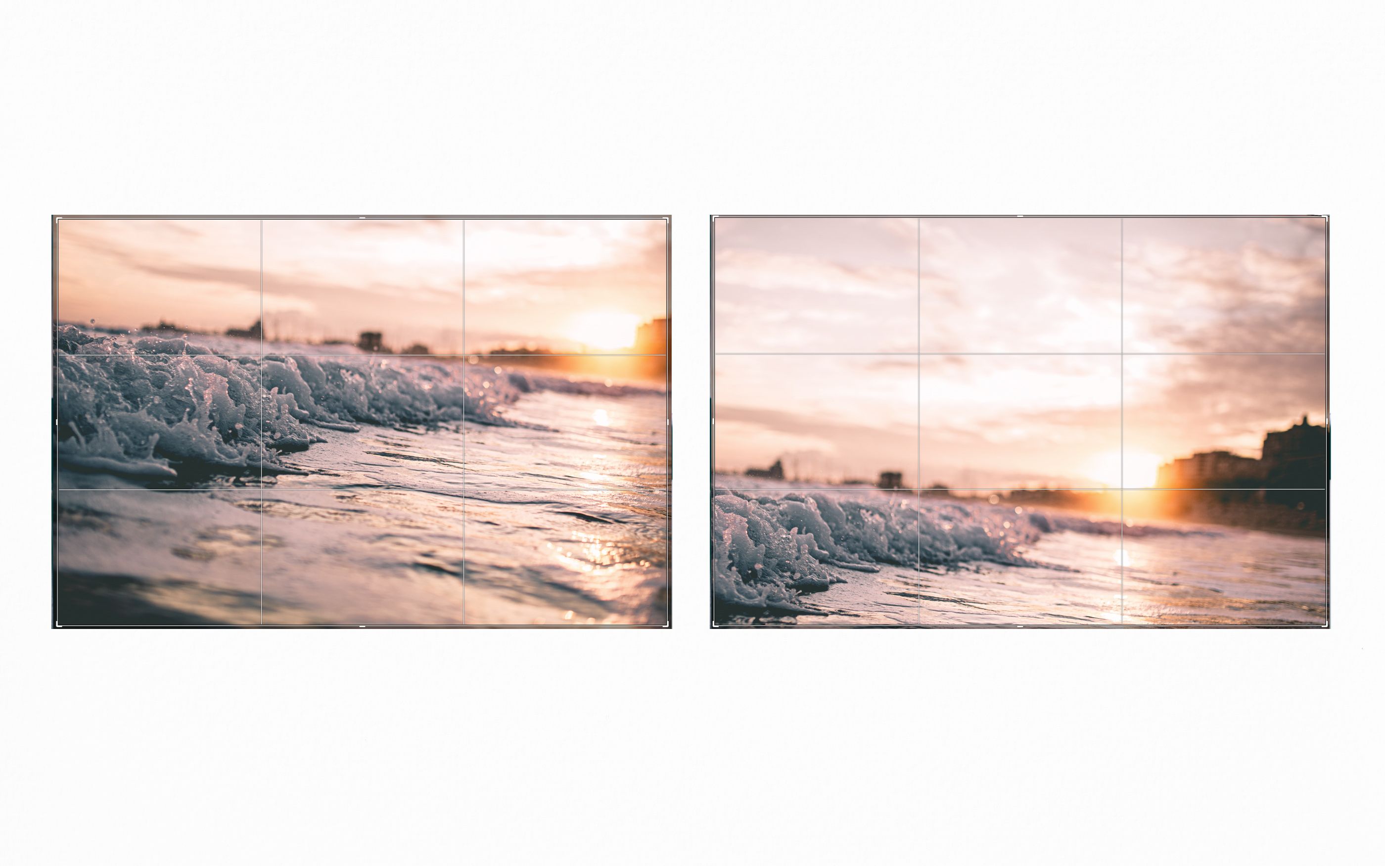
Centering the subject in the frame also works - for close-up portraits this can add an extra personal layer, as well as suggesting a clutter-free effect around a particular object/subject. Therefore, this technique is often used in the production of product photos. If we place the motif on the right third line, we create a more open, accessible and interesting picture effect, additional shifting to the upper third line gives us the feeling of eye level.
Other points that influence the effect and dynamics of the image composition are the arrangement of the vanishing lines (static or oblique), symmetry, pattern, "white" space, simplicity, fullness, the shape rules, etc.
Point of focus/depth of field: In order to emphasize the subject even more clearly and/or to integrate it into the overall composition, the opening of the aperture plays a role. This allows us to control how small or large the focus area of the subject we are focusing should be. Particularly open apertures soften the unfocused area (bokeh) and make the subject visible in front of the background. This effect is particularly suitable for people, motion and detail photography.


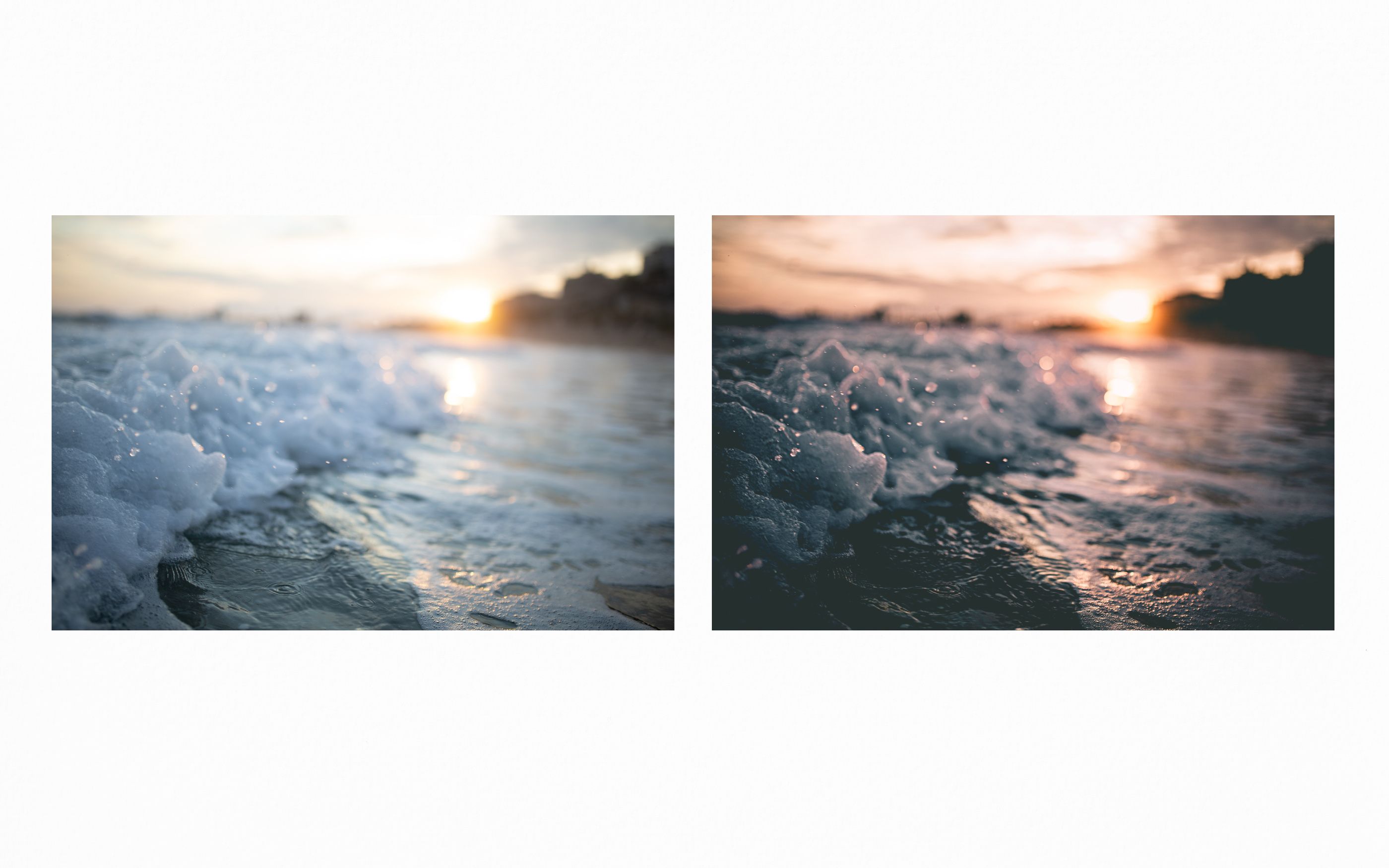
The color world of pictures has a special influence on the emotional component in that we can absorb whole moods with it. Cooler images often mean cooler emotions, e.g. sadness, melancholy, neutrality, but also winter, ice, straightness; Top-heaviness, etc., while warm colors are more associated with bubbling feelings such as love, cordiality, joy, summer, warmth, etc.
Image style: From glossy to editorial, motion, retro, clean, etc. - There are many ways to steer photographs in a certain direction using common image editing programs, for example to make them look "retro" or even completely clean and tidy. However, it is only important that the starting material already offers the appropriate basis for this.
Despite all the emotion that we create in our storytelling, it is important that we make a distinction when creating product images. Of course it makes sense to show garden furniture "in action", but it is just as important to photograph the products against a neutral background (preferably white or light grey), clean, colourfast and from all important sides, including in detail. Combined with the vivid story visuals, this reassures the viewer and increases the potential of a purchase.
4. Quality
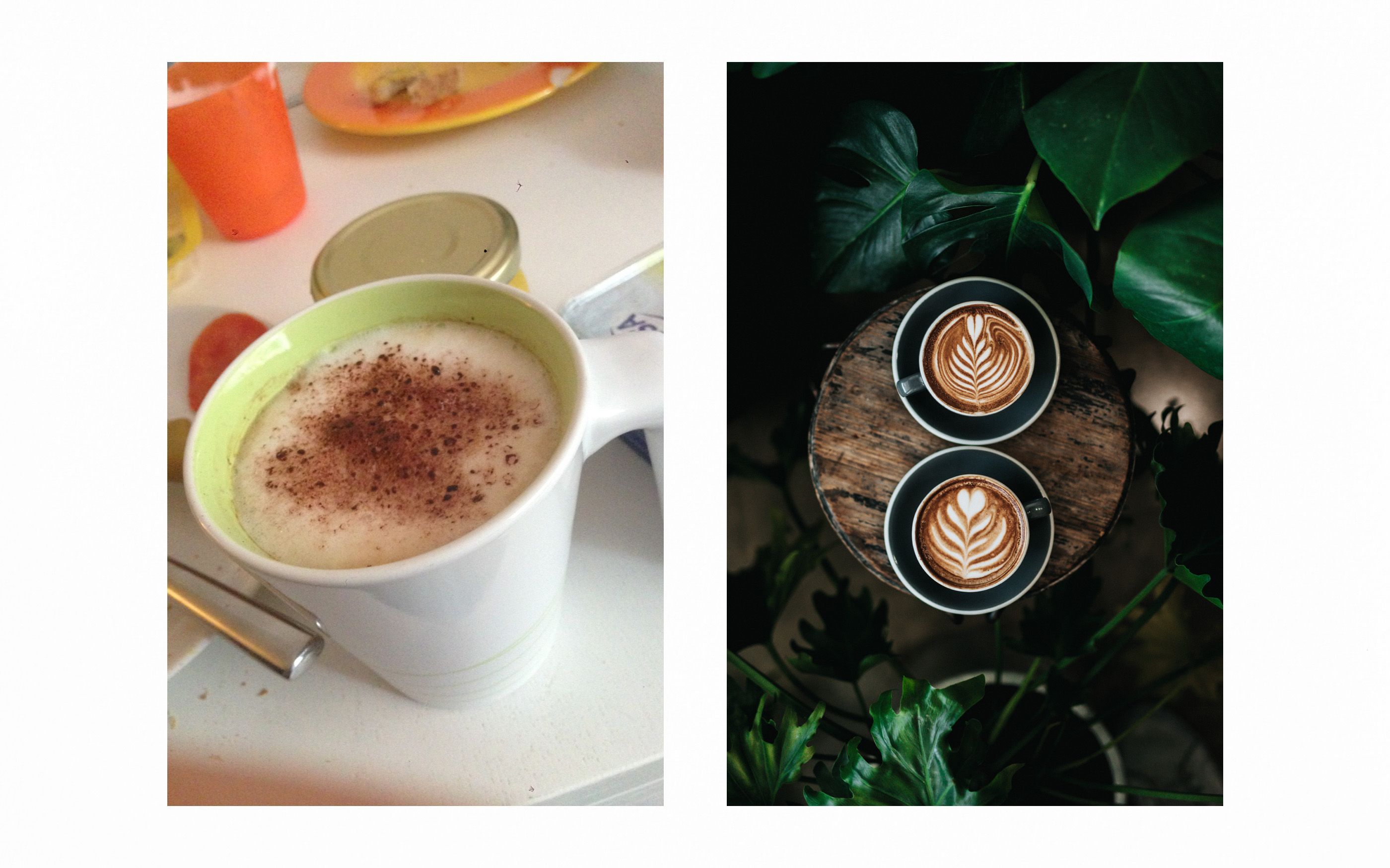
There are many ways nowadays to generate a "clean" and high quality image (starting from the technical aspect). We prefer to use a good DSLR or mirrorless system camera with which we have the option of making manual settings and, above all, taking large-format pictures.

Firstly, it is never nice to look at images that are pixelated, noisy or have artefacts, and they can suggest a lack of quality, especially in online retail – the perceived high quality can be found in precisely such details. Secondly, we would do well if there was the possibility of zooming into the product images. If we were buying locally, we might want to run our hand over the surface of a piece of furniture and maybe look at grain and the like up close. Here, too, we can see that details enhance the product presentation.
By the way, if you want to work with stock photos, it should be said that in most cases there is also the possibility to buy very large pictures. Our tip is to always buy/create the source material a bit larger than necessary.
5. Performance
Not to be underestimated are the loading times of websites, which are often pushed up when images are not formatted at all or incorrectly and huge file sizes are created. Depending on the area of application, we can orientate ourselves to around 200kb per image, which can of course sometimes be more or sometimes less - 1MB, for example, would be too large and would severely impede the loading process. It is advisable to coordinate this with the responsible frontend developer, because there are not only tools for common image processing programs (Lightroom, Photoshop, etc.), but also server-side plugins for CMS, shop systems, etc., which deal with the mass processing of digital products quickly and efficiently.
6. SEO/SEA suitability
This is also a case for a corresponding specialist, but so important that I don't want to leave it unmentioned. Google penalizes us if it cannot index the images in a search engine-friendly manner because, for example, meta and alt tags are missing. As image creators, we can at least do so much that we think of the right metadata in the image information (directly on the photo) and which we can also tag, among other things. In addition, Google notices a meaningful name that contains the motif in the picture, the purpose and the company, for example, more positively than a cryptic combination of numbers and letters.
Yes, the conception and creation of image worlds is a wide and exciting field in which we can lose ourselves endlessly. All of the points mentioned here are areas of knowledge that, each on its own, are much more extensive than outlined here. Nevertheless: If we only pay attention to a few of the above suggestions in our online project, we will secure a large part of our desired quality and thus the goodwill of the target group.
