AI knows what websites look like. It doesn't know how users think.
Why we shouldn’t use AI to build more digital products – but better ones
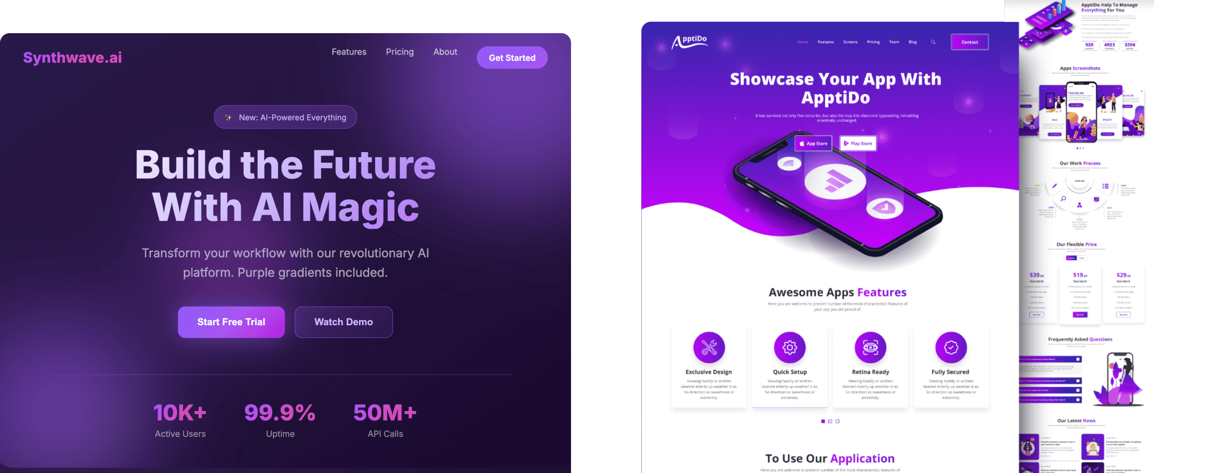
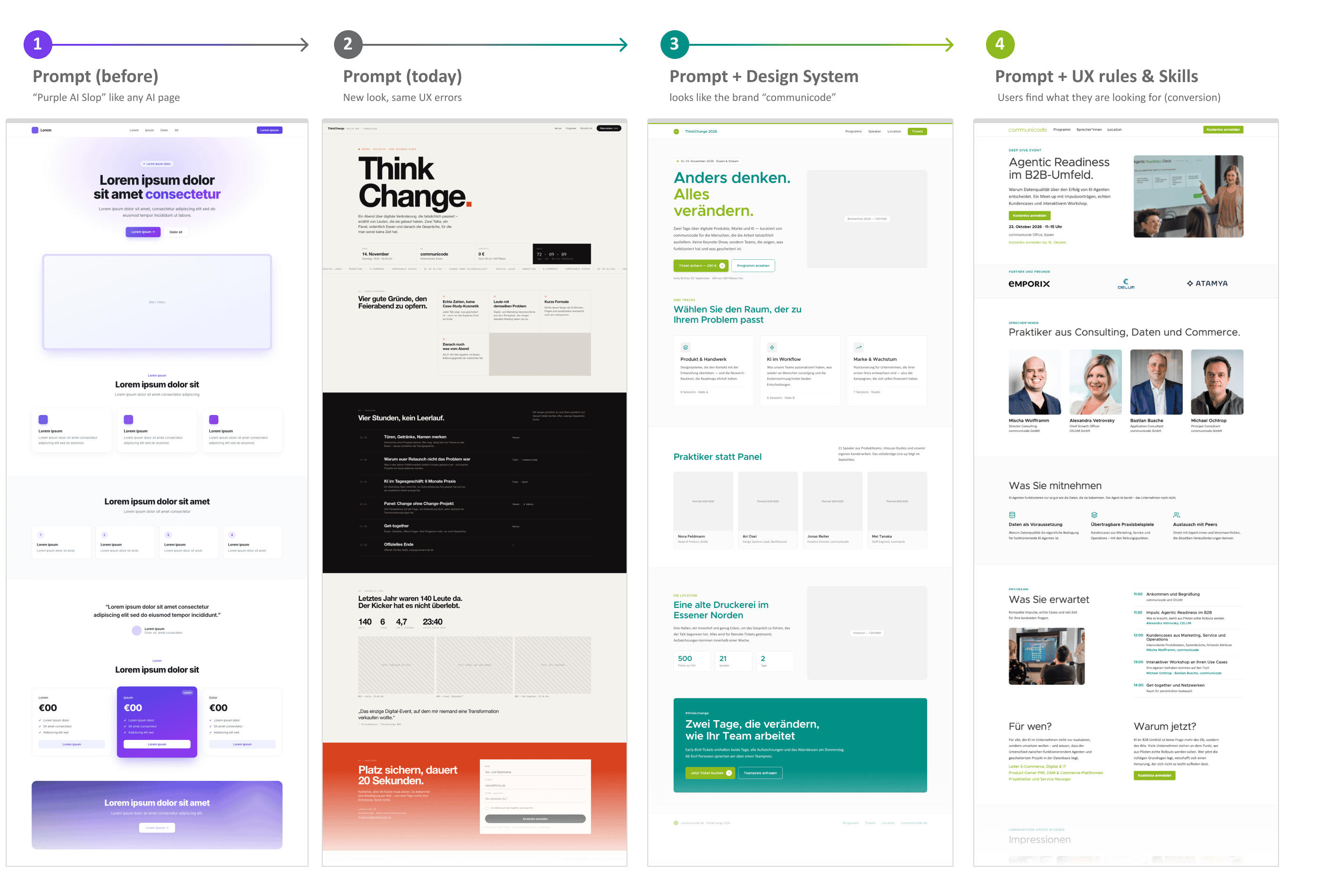
When I first tried out AI web design, the pages looked strikingly similar no matter which AI I used: indigo and purple gradients, the Inter font, large hero sections, and the typical SaaS look.
This was also called “Purple AI Slop”. AI-generated websites were instantly recognizable because of this – just as early AI images were easily spotted by hands with too many or too few fingers.
Purple AI Slop: Why did AI websites all look the same?
The reason lies in the training data. The models didn’t learn from the best websites, but primarily from websites that were publicly available and well-documented.
In tutorials, on GitHub, and in demo projects, the same frameworks – such as Tailwind CSS – kept popping up over and over again.
And with Tailwind, Indigo colors, the Inter font, and so on had long been the default configuration. And many developers simply never changed these defaults.
So the AI learned: This is what modern websites look like.
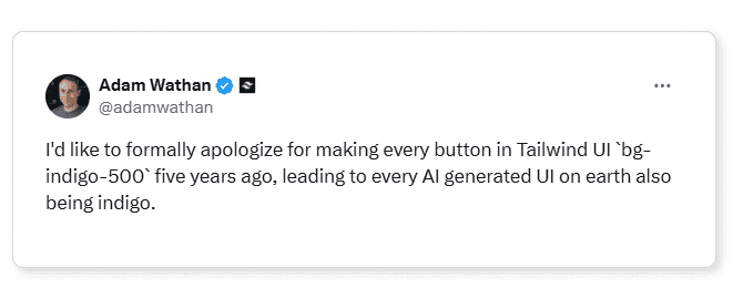
Adam Wathan, co-founder of Tailwind, “apologized” last year for the fact that, because of his default settings, every AI website suddenly had Indigo buttons. I think he was actually very proud of it. 😆
The “Purple” problem has been fixed. The UX problem hasn't.
AI-generated websites now look significantly different.
But that's not because the AI models have suddenly gained a better understanding of design. The developers have simply made improvements. Claude Design, for example, uses a skill that recognizes typical AI clichés. Simply put, it checks for things like:
Is the page purple again? Then use a different color. Is it using Inter as the font again? Then use a different font, and so on. The “Purple AI Slop” problem has thus largely disappeared.
However, this isn’t a real design breakthrough. It just means that today, not all pages look like Tailwind defaults anymore.
For many companies, this sounds like good news at first. Landing pages, campaign pages, and microsites can be created much faster today than they could just a few years ago. But a page that looks good doesn’t automatically generate leads, sign-ups, or conversions.
The actual UX problems remain.
Testing an AI landing page: A beautiful UI doesn’t equate to good UX
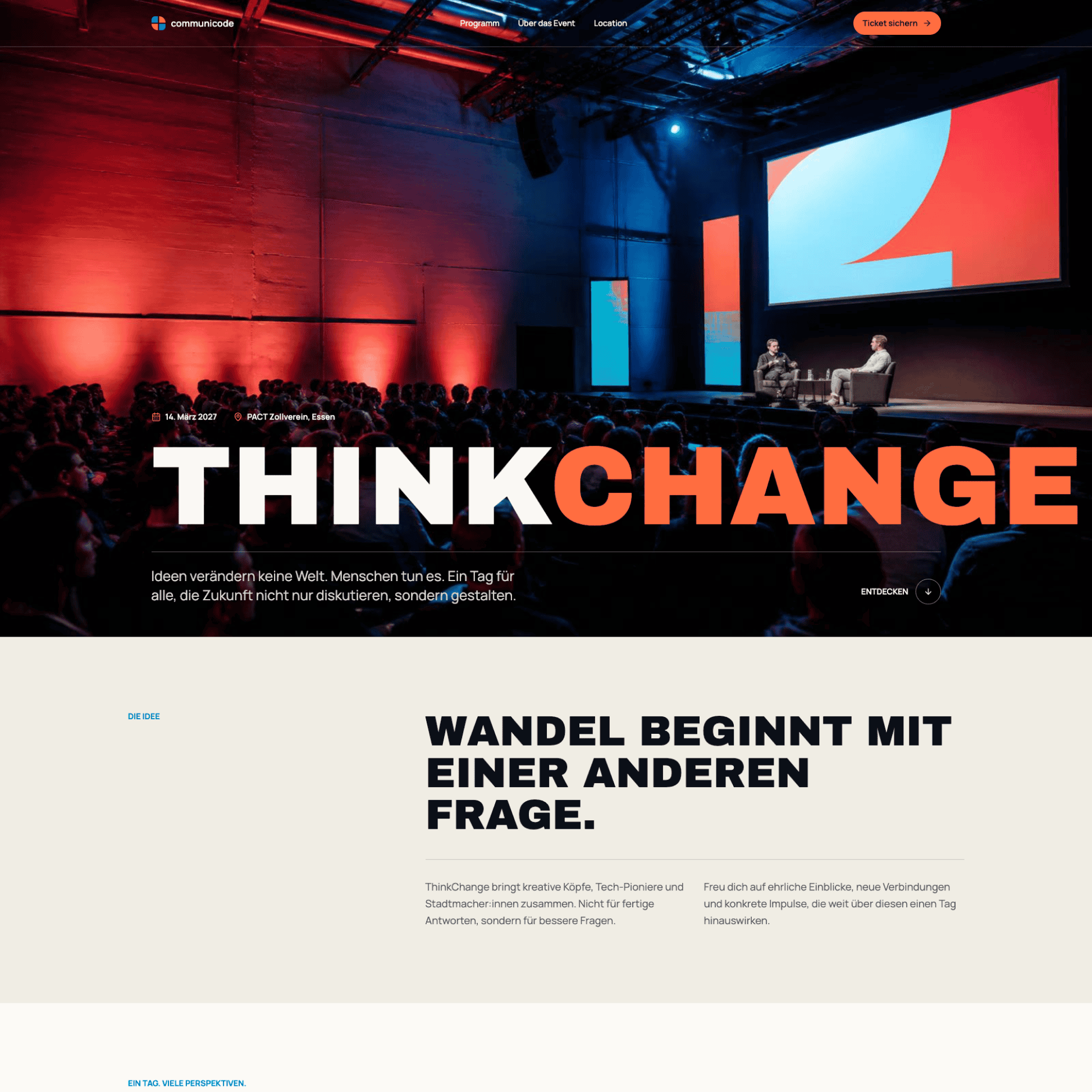
For my article, I gave the same task to various AI tools: Create a landing page for our ThinkChange event.
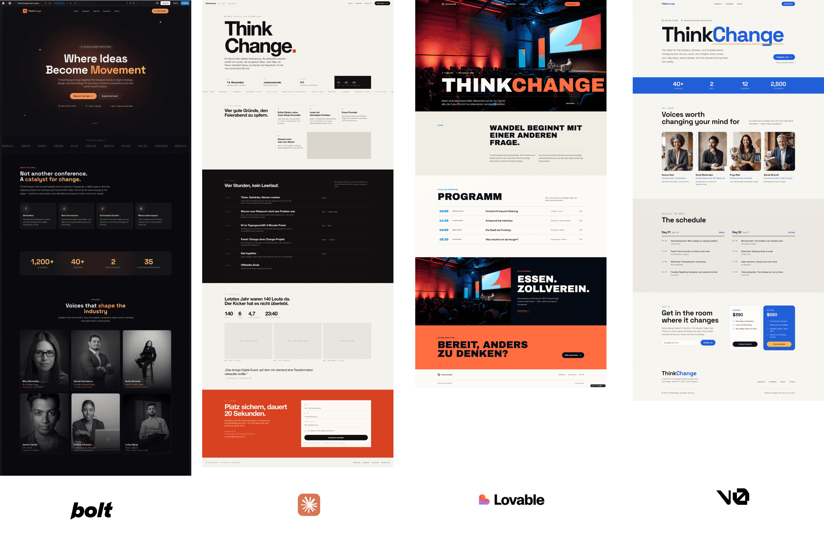
At first glance, the results looked different – and surprisingly good. But if you take a closer look, all the models reveal very similar weaknesses. Let’s take the page generated with Lovable as an example.
In this design, the date and venue are placed above the headline in a small line. Visually, this looks modern. For users, however, it makes little sense. The date and venue are among the most important pieces of information on an event page. So why are they so inconspicuous? They’re barely legible.
The AI has adopted a well-known design pattern here. In editorial design, this small line is called an “overline”; on the web, it’s often referred to as an “eyebrow.” Its purpose is to provide users with context. “Network Event” or “Webinar,” for example, would be useful information here.
AI doesn't understand what information is actually important to users.
For marketing teams, this has a direct impact on performance. If important information appears too late or is too inconspicuous, users won't make a decision – that is, they won't register for the event.
AI and UX Design: Likely doesn’t mean good
This is precisely where the greatest weakness of today’s AI systems lies: They haven’t learned what the best solution is. They’ve learned what the most likely solution is. But likely doesn’t mean good. Likely often just means: not bad.
A design pattern is used because it’s common – not because it’s the right solution for the specific use case.
So what helps? Essentially, you need to teach the AI two things to create a website that’s both brand-aligned and functional:
What your brand looks like.
How a good user experience works.
Design System
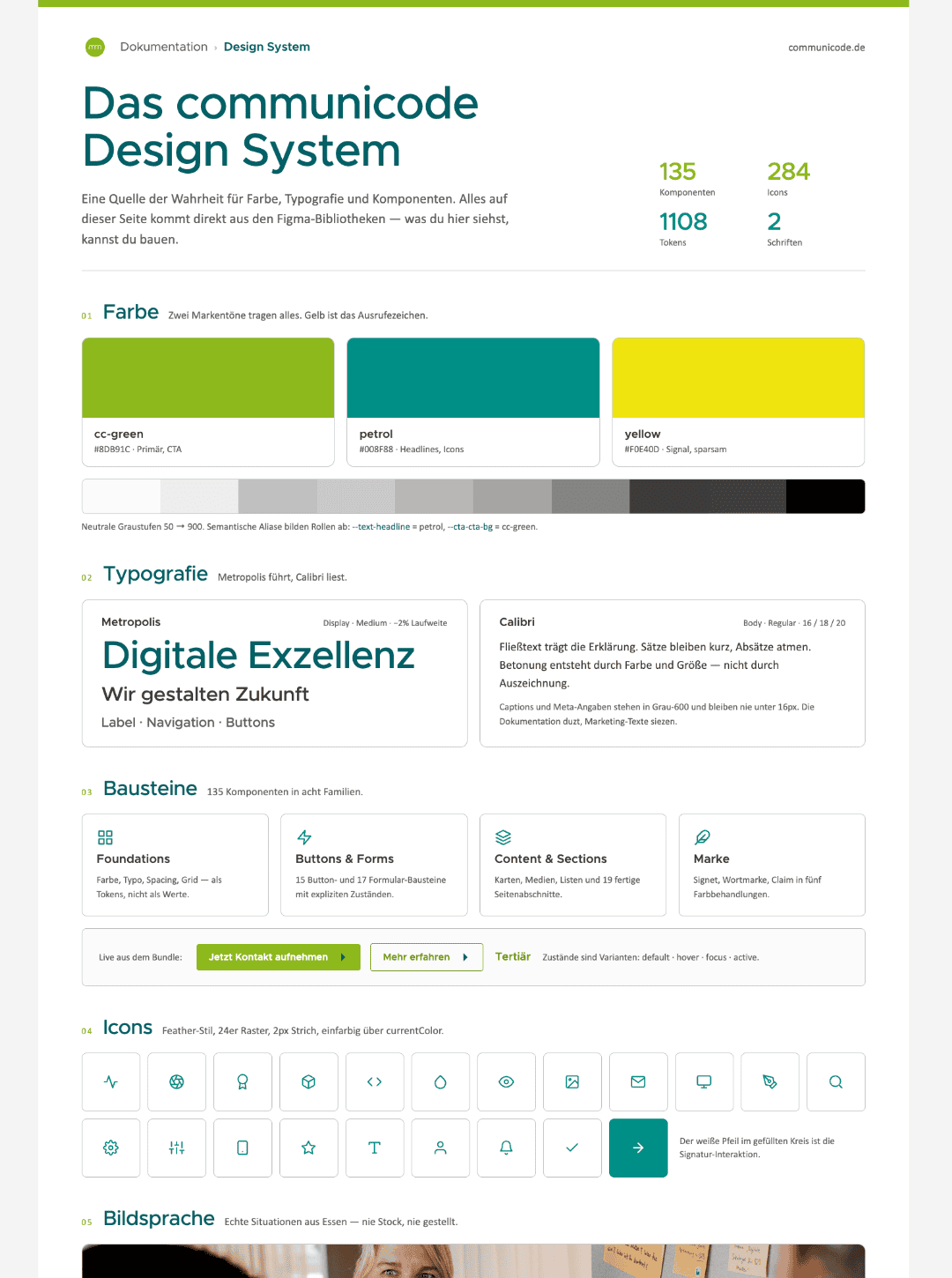
When AI has access to a design system, it can adopt colors, typography, components, and spacing. For this to work, the design system must be well-maintained and accessible to the AI. In our case, colors, fonts, components, and design tokens come directly from Figma.
The result looks much more like our own brand. The generated landing page suddenly looks like a communicode page. However, this doesn’t make the UX problems go away. The same information hierarchies, the same prioritization errors, and the same weaknesses remain.
The design system improves the interface – not the user experience.
This makes a design system even more important, especially for marketing departments. When campaign pages can be created in just a few minutes in the future, the design system ensures that the brand identity remains consistent nonetheless.
UX knowledge
There are now numerous UX skills and prompts that teach AI established UX principles. This helps avoid obvious mistakes and apply best practices. For a simple event landing page, that would likely be sufficient.
Here are a few examples: The “accessibility-review” skill checks designs for accessibility according to WCAG 2.1. “Cognitive Load - Conversion” identifies points where users feel overwhelmed and abandon the page. “UX Heuristics Review” evaluates interfaces based on the 10 usability heuristics. “ui-ux-pro-max” provides knowledge on styles, colors, typography, and UX guidelines. And “General Design Review” concisely summarizes the most important UX issues. A skill called “Grill Me” starts even earlier, before any design work begins: It asks you critical questions about a plan or concept until all key decisions have been clarified. This way, you’ll have a clearer understanding of what the site is supposed to achieve – and can communicate that to the AI.
I still wanted to see what would happen if we gave the AI more information. So, for the event page, I provided the AI with typical UX guidelines.
Visitors should be able to understand the following without scrolling:
- what the event is about,
- when and where it takes place,
- who it’s intended for, and
- how to register.
The date, location, and registration should be immediately visible. I also included speakers, social proof, readability, mobile usability, and a short form. Afterward, I conducted a UX audit using various tools and made optimizations.
The result was significantly better. For a simple landing page, this basic knowledge is often sufficient. Still, you have to test the result: first using your own experience and UX knowledge, then with real users.
In B2B, a good prompt isn’t enough
For our clients, however, the reality is usually different, especially in B2B. We design online stores, portals, and digital platforms with complex processes, diverse user groups, and specialized requirements. Of course, I can write complex prompts or install a UX skill. That way, the AI learns how good UX works in general. But it doesn’t learn how a buyer places an order with our client, what approvals they need, or why they’re still sending Excel spreadsheets via email today. We only learn that through interviews, workshops with the business departments, and usage data. The AI doesn’t ask about that. It fills in the gaps with the most likely solution. But that solution rarely aligns with the processes of a B2B company.
We’re now seeing this play out in practice quite often with clients.
Recently, a front-end developer asked me if a UI screenshot in a ticket came from our UX team. It didn’t. The client had created the interface themselves using AI. And that raises the question: What do we do with it now? At first glance, the UI looked good, but it didn’t fit the portal’s existing user flow at all.
AI makes it easier than ever to create new interfaces. If no one keeps the entire user journey in mind during this process, UX debt accumulates.
The new threat: UX debt caused by AI
Most people are familiar with technical debt. It arises when development outpaces architecture.
UX debt arises when interface production outpaces experience design.
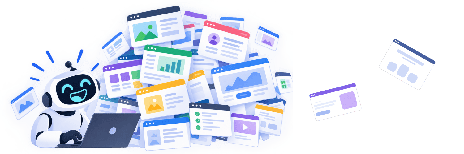
The real danger isn’t that AI builds bad interfaces, but that we suddenly end up building many more interfaces. We’re seeing this happen with our clients – and sometimes even with ourselves. That’s because today, websites can be built in hours instead of weeks.
A typical situation in everyday AI use
A department quickly builds a landing page using AI. Then they spend a lot of money on Google Ads. Thousands of people visit the page. But there are no conversions (meaning no one signs up for the event).
A sample calculation:
A department builds a landing page using AI and invests 2,000 euros in Google Ads (this is the recommended monthly budget in B2B). At 1.20 euros per click (ranging from 0.30 to 15 euros, depending on the industry), the page attracts around 1,670 visitors. What happens next depends entirely on the landing page:
- The AI page: 2 sign-ups = €1,000 per sign-up
- An average landing page (2.35%): 39 sign-ups = approx. €51 per sign-up
- The top 10% of landing pages (over 11%): approx. 190 sign-ups = approx. €10 per sign-up
(Comparative figures based on an analysis of thousands of Google Ads accounts)
So the goal is clear: We want a landing page that ranks among the top 10%. How do we get there?
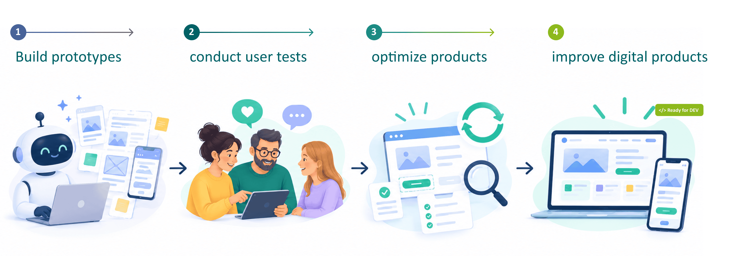
Build a prototype using AI and test it with 3 to 5 users. Just 5 users can uncover about 85% of usability issues (according to the Nielsen Norman Group). A test with 4 people from your own target audience costs around 380 euros (including selection and compensation) on a recruitment platform like TestingTime. Even if you deduct that from your advertising budget, you’re still left with around 155 sign-ups at about 13 euros each.
User testing is inexpensive, quick, and always leads to better decisions. This is a huge opportunity, especially for marketing professionals.

We don’t need more digital products. We need better digital products.
In the past, variations, A/B tests, and clickable prototypes were time-consuming and expensive. Today, with AI, we can test significantly more ideas, build prototypes faster, and gather feedback from real users much earlier.
This allows us to make better decisions before budget is allocated to development, campaigns, or rollouts.
The result isn’t more digital products, but better digital products.
This isn’t really a new insight. It’s user-centered design. Thanks to AI, it’s never been easier or more affordable to consistently implement this approach.
Test together before the campaign launches
Are you planning a landing page or campaign? We’ll review the page before you commit any budget:
- We’ll work with you to develop an AI prototype of your page.
- We’ll test it with 3–5 users from your target audience.
- Within 4 days, you’ll receive the most important optimization recommendations to boost conversions.
Let’s discuss your project with no obligation.
FAQ – Frequently Asked Questions About AI, Web Design, and UX

Stephanie Ebbert
Stephanie is a UX Designer and Art Director with over 12 years of experience. At communicode, she designs and optimizes digital products such as websites, online shops or apps. She advises customers from the B2B as well as from the B2C area. Her passion for developing digital products is shaped by the human-centered design mindset. Stephanie is convinced that user testing, user interviews and psychology play a bigger role in good user experiences and successful shops than just beautiful design.